PROJECT OBJECTIVE
Develop a new collection of ceramic wall tiles for the American market at the request of Roca Tile USA, a division dedicated to the manufacture, distribution, and commercialization of ceramic tiles from the Spanish group Roca. The goal was to create various decorative faces that harmonize with each other, allowing multiple combinations while respecting the production limitations and exploring Portuguese tile work with a contemporary perspective.
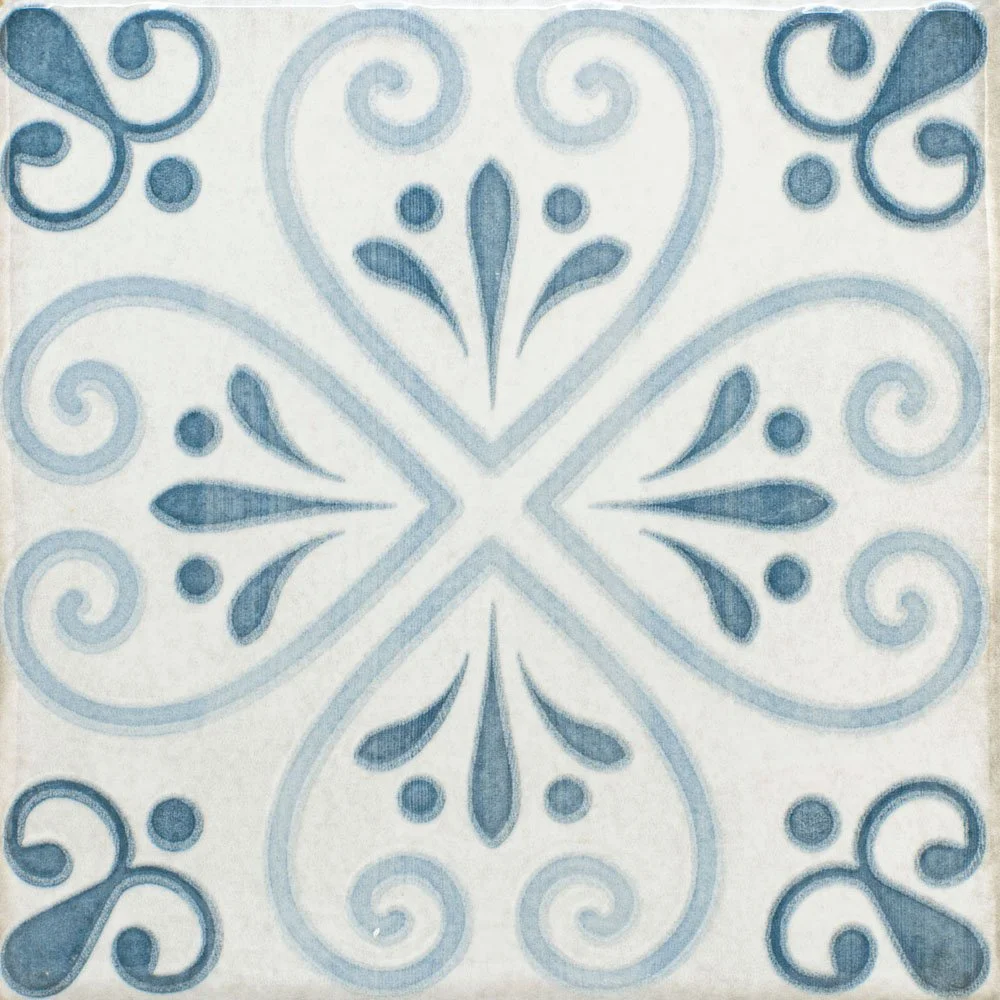
1. BRIEFING AND RESEARCH
The project began with a briefing that established Portuguese tile work as the main inspiration for the creation of the tiles. The idea was to explore the richness of traditional patterns, bringing a contemporary interpretation to meet market needs. The proposal involved creating multiple decorative faces that could be harmoniously combined.
Visual References: Typical floral patterns of Portuguese tiles.
Inspiration from the facades of Portuguese houses: The color palette was based on the tones of the facades of old houses in Portugal, with shades of blue, green, soft yellow, and soft coral, reflecting the country history and culture.
2. SKETCHES AND MANUAL DEVELOPMENT
From the visual references, I made sketches to explore different designs of floral elements typical of Portuguese tile work. The aim was to design modular faces that could function individually and in combination.
Alternatives generation
3. DIGITIZATION AND VECTORIZATION
After selecting the most compelling drawings, they were digitized and vectorized in CorelDRAW. The vectors were intended to serve as masks for the study files in Photoshop.
4.TEXTURIZATION AND COLOR STUDY IN PHOTOSHOP
In Photoshop, I applied textures and colors. The palette was inspired by the facades of old Portuguese houses, with shades such as blue, soft green, yellow, and pink. This combination of colors evokes the history and architecture of Portugal. The color selection also considered the printer's limitations, ensuring precise and consistent reproduction of the shades.
- Worn Textures: I applied textures to simulate an aging effect, adding a sense of authenticity to the tiles.
- Irregular Surfaces: The decision to use an irregular surface was made by the Product Development Manager, who envisioned that it would complement the designs and aesthetic of the collection, providing a more artisanal and unique experience for the tiles.
5. PROTOTYPING AND REFINEMENT
Test samples were created to validate the combination of decorative faces and the fidelity of the colors. This stage allowed for:
Validating the harmony of the faces in different compositions and ensuring the design was visually balanced.
Adjusting texture details and colors to achieve the desired effect.
Evaluating the detail of adding the sinking effect to the outlines of the designs.
Evaluating how the faces interacted and how they behaved in larger wall areas.
During the prototyping process, the design team, technical staff, and Design Manager evaluated which faces would be presented to Roca USA. Together, we considered the technical feasibility, client requirements, and production limitations to ensure that the selected faces were the most suitable, both aesthetically and functionally.